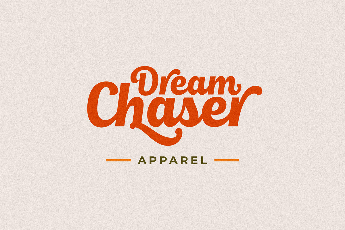

Script fonts are often used for brand identity, product packaging, wedding invitation, and many more. This type of font will never go out of style because of its versatility. It can easily display a playful, romantic, grungy, or classic aesthetic depending on the script font you choose.
Pairing fonts will give fresh air to your branding and will make your logo stand out. However, you cannot pair random fonts, especially for a logo design. Pairing random bold script fonts can make your logo looks clashed or inharmonious.
It is important to create a harmonious and balanced composition when you are pairing fonts. Here are some pairing tips you can use as a guideline.
Since the script font will be your main font, it will be easier to find the pairing if you already decided on the script font first. It will save more time to look for one font instead of directly looking for a pair.
Find out the tone and messages that you want to convey with your fonts. Then, find the script fonts that best represent the tone and messages that you are looking for. You can take your time when choosing the first font since it is going to be the dominant design of your brand. Therefore, you will need to put your intention into choosing it.
When creating font pairing, you will need to create a good contrast between the two fonts. A good contrasting font will not only make your brand looks visually interesting but also make sure that the fonts are not competing with one another.
Because script fonts tend to look organic and fluid, you will need to find a contrasting font for the pairing that looks simple and structural. Make sure that the two fonts complement each other. Do not use another script font as a pairing because it will be hard to differentiate with the first font and they will clash.
When you are pairing two fonts, make sure that you use the script font as the headlines. Since script fonts have decorative shapes, they may be not as legible when you use them in smaller sizes. Therefore, use the script font as the key branding element, and then choose a more readable font for the second font that is used for smaller details or the body of text.
Try to experiment with different sizes and proportions so that you can create a visual hierarchy and balance. You can use larger script font as it will be used as the main font. Then you can use smaller supporting fonts to provide structure. Test out the proportions to make sure that the fonts complement each other.
There are plenty of fonts to choose from when you are creating font pairings. However, remember that the right font pairing will depend on the personality, target audience, and design aesthetic of your brand. You will need to consider these aspects when exploring the font combinations. This will help you create a cohesive font pairing and help your brand looks visually pleasing.
Choosing the right font pairing for your brand is a crucial step in creating a visually appealing and cohesive design. When working with script fonts as your main font, it’s important to consider the tone and messages you want to convey and find a script font that best represents them. Once you have chosen your script font, you can then look for a contrasting font that complements it and creates a visual contrast.
Hierarchy and readability are essential factors to consider in font pairing. Use the script font for headlines or key branding elements, as its decorative shapes may be less legible in smaller sizes. Select a more readable font for smaller details or body text to ensure clarity and ease of reading.
Experiment with different sizes and proportions to create a visual hierarchy and balance between the fonts. Using larger script fonts for main elements and smaller supporting fonts can provide structure and visual interest. Test out different proportions to find the right balance that enhances the overall design.
Remember, for Pairing Fonts for Bold Script the font pairing you choose should align with the personality, target audience, and design aesthetic of your brand. Take these factors into account to create a cohesive and visually pleasing font combination that represents your brand effectively.